The Saga Collection

Labria


This figure is a repaint of the figure that was first released in the POTF2 (Power of the Force “2”) Cantina Aliens cinema scene. I borrowed heavily from that review, but made some relevant changes specific to this newer release.
I thought it was odd that we didn’t get a Labria figure back in the vintage Kenner era. He’s certainly one of the more identifiable characters from the cantina scene courtesy of a solo glam shot early in the sequence. Getting Labria in 1998 definitely scratched a two-decade itch, but the effort is only mediocre. The massive plastic cape saps the action figure of much of its action. Thank goodness that plastic capes aren’t a thing anymore (sarcasm mode off). Limited articulation isn’t ideal, but if a figure can stand well, it can be passable. This wants to tip over backwards. You can normally remedy this by moving one of the feet slightly back, but the aforementioned plastic “wall of capery” precludes this. The facial paint applications and the color of plastic used for the head of the original figure were quite unfortunate. It made Labria far too pale and left him with bloody gums for some reason. This repaint corrects both of those issues greatly, and they combine to make a huge difference. But in software, there’s an expression: fix one / break one.
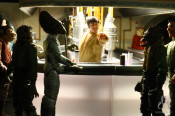
That means that for every bug you fix, you create a new one. The end users call it annoying. I call it job security. It seems Hasbro adopted the “fix one / break one” methodology with this Labria figure. The paint applications on the head are fixed, but they broke the accuracy of the rest of the costume. First, neither figure is truly accurate with respect to what Labria is wearing on set. Labria does not wear a cape. He appears to be wearing a black vest over black or charcoal colored shirt. Note the fancy cravat actually does appear accurate:

With this in mind, you would have to say that painting Labria’s shirt and cape lapels gray is a step backwards from the first release in terms of accuracy. But by the same token, painting the cape lapels gray does give the illusion of the “v-shape” a vest would create. It also makes for a more visually compelling figure. The black on black of the first release effectively mutes what little sculpting detail there is. At least the gray brings it out. Considering how totally inaccurate the sculpt is, it’s almost a case of “what does it matter?” Since this figure is steeped in wrongness, you might as well go with the more compelling paint applications and take the best looking “wrong” you can.
No matter which release of Labria you choose, you’re going to have to make the best of a bad situation. If you take the original POTF2 release and remove the cape, you’re somewhat in the ballpark for costume accuracy, but the paint application on the head are wretched. If you choose this TSC release, the paint applications on the head are greatly improved, but the already inaccurate wardrobe takes another step backwards in accuracy (but looks better).
There have been some otherwise decent figures in the history of the line that have been completely undermined by horrible head sculpts. The TAC 30-06 Mace Windu figure springs to mind. Conversely a terrific head sculpt can make the most of a bad figure. I feel that is the case here. The paint apps on the head of this release of Labria are so much better that it makes it the better of the two, costume inaccuracies be damned. The original release got a 3 out of 10, and this one gets a 4 out of 10. But a modern update of Labria really needs to be made at some point.